PREV ARTICLE
NEXT ARTICLE
FULL ISSUE
PREV FULL ISSUE
SECURITY FEATURES ON AUSTRALIA'S NEW BANKNOTE
Here's an excellent article on the great new security features on the new polymer Australian $5 banknote. This is just an excerpt -
be sure to see the complete article online and check out the video and excellent animated images. -Editor
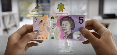
Australia has a new $5 banknote, and it looks expensive. Put all issues of taste aside, and I see nothing short of cash bought from the future. It’s a psychedelic trip to the bank, layered in metallic foils and a seemingly endless array of color shifting inks that glisten like an oil slick. Bend the note, and a printed bird flaps its wings. The ink has texture. It even has nubs. Part of the bill has been carefully primed like paper, while part has been kept relatively pristine and pure, pushing printing technologies to their limits. And perhaps most notably, the center of the note isn’t printed at all. It’s a clear window, revealing the note’s greatest coup: This bill wasn’t printed on paper, even though the texture feels that way. It’s a magic trick of plastic. In a world full of smartphone payments and cryptocurrency, 85% of all transactions are still done in cash. Australia actually sees cash demand rising at a steady 6% to 7% per year with no decline on the horizon. Yet, as printers and scanners become more sophisticated, the government has moved to ensure that its currency is safe. "What we noticed in recent years, with the availability of technology—particularly around reproduction technology like scanners and printers—counterfeiting in Australia had started to increase. We’re in the fortunate position where it’s still pretty low but it is rising," says James Holloway, deputy head of note issue at Reserve Bank of Australia. "We thought we just don’t want it to keep rising in a sustained fashion, so the time had come around upgrading security." Now the Reserve Bank has released a new design of the $5 note, soon to be followed by a complementing makeover of its entire line of currency. And after speaking with James Holloway about the 10-year process behind the design of their new note, I can assure you, crime doesn’t pay. Counterfeiting just sounds way too hard. MONEY'S BIGGEST SECRET IS THAT IT'S JUST REALLY HARD TO PRINT "What you’re trying to do is create a banknote that’s very difficult to forge, either in being costly, or in effort. If someone has to go through a huge amount of effort to reproduce these to pass it, it’s not going to be a cost-effective proposition," says Holloway. "If we make it just too difficult for them, they’re just not going to be tempted." Australia’s $5 note has been in development for a decade. It began with three concept designers reimagining the existing currency with royalty, flora, fauna, and more than 200 proposed security measures. That was only step one. Most of the real work happened when the winning design was taken to the country’s banknote printing industry, and over years, engineers figured out how they could actually produce the most complicated bill they could imagine. Because in a world where our off-the-shelf ink-jet printers can seemingly print anything, currency has to be designed to be as unprintable as possible. When Australia moved to polymer banknotes 25 years ago, it raised the bar. Have you ever tried to draw on plastic—maybe the back of your credit card—and smeared the ink? Printing on plastic cash is similarly difficult. Even today, smearing and bleeding are real issues at the industrial scale, and the modern Australian banknote continues to exploit this fact in several ways, pushing printing to its technical limits. They feature microprint—tiny text that’s difficult for machines to handle. Then they squeeze "security features"—those complex printed foils are embedded with holograms, while color-shifting inks seem to spontaneously catch light in a predictable rainbow—very close to one another. "We’re trying to cram a lot of different things in a limited space, and printing to tight tolerances so colors don't bleed from one part to another," says Holloway. Any graphic designer would find the results fairly hideous, and yet, they’re very hard to reproduce. As for the image of the queen, that’s been rendered like an engraving, with long, spindly, and swirly lines. It’s a throwback to an older aesthetic we expect in currency, but this linear graphic approach is also "very difficult for most printers to reproduce," says Holloway. "Most printers are dot matrix, so if you look under a microscope, they’re just a lot of dots put together. So it’s actually part of the security printing process." In other words, older print graphics are actually harder to counterfeit. To read the complete article, see:
Wayne Homren, Editor The Numismatic Bibliomania Society is a non-profit organization promoting numismatic literature. See our web site at coinbooks.org. To submit items for publication in The E-Sylum, write to the Editor at this address: whomren@gmail.com To subscribe go to: https://my.binhost.com/lists/listinfo/esylum All Rights Reserved. NBS Home Page Contact the NBS webmaster 
|