
PREV ARTICLE
NEXT ARTICLE
FULL ISSUE
PREV FULL ISSUE
DICK JOHNSON CALLS FOR THE REPLACEMENT OF THE ANA'S LOGO Dick Johnson submitted these thoughts on the American Numismatic Association's logo. -Editor 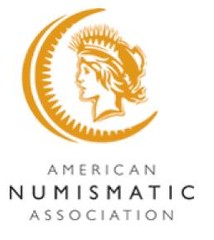 Resolved: In the year 2009 the ANA will replace the atrocious logo it is currently using. Resolved: In the year 2009 the ANA will replace the atrocious logo it is currently using. Would you believe a numismatic organization chose the worst possible logo as a symbol of an organization of people who collect glyptic items with a graphic design? That is stupidity raised to a factor of five. Glyptic objects are coins, medals and tokens, it is the raised relief design on these numismatic items. Engravers and numismatists call it "relief," a sculptor creating a sculptural model as a pattern for a coin or medal calls it "bas-relief" (the "s" is silent -- it is pronounced baa-relief). [If you are interested I listed the six different kinds of relief found on numismatic items previously in E-Sylum -- vol 10, no 37, art 10 for September 16, 2007]. To read Dick's earlier E-Sylum piece, see: DICK JOHNSON ON THE DEFINITION OF HIGH RELIEF (http://www.coinbooks.org/esylum_v10n37a10.html) -Editor Graphic designs are two-dimensional as a drawing on a flat surface. When an artist introduces a third dimension, as raised lettering, it becomes a glyptic design. It incorporates the modulated relief of the design. Thus we should NOT have a two-dimensional graphic design as the symbol, trademark, or logo of the ANA. This present logo -- the lady in a crescent -- is a holdover from the tainted administration of executive director Chris Cipoletti. It was a Colorado Springs ad agency who came up with this inappropriate, misguided, inapt design which an unknowing Cipoletti installed in 2003 replacing the Students Lamp of Knowledge in use for decades prior. I wrote a long editorial castigating this design which was published in Coin World July 29, 2003. Everything I said in that editorial still holds true. The new design missed capturing the essence of numismatics. Much of the charm of numismatic items is the detail they display, I said. Not only is detail excoriated from the new design, it appears to thrust fuzzy outline and crude figures, the furthest thing from what's on coins and medals, to the forefront. The five factors of stupidity: overlooking the three dimensions on coins, medals, tokens, the lack of detail, replaced with a fuzzy graphic. On March 22, 2008 I wrote the new ANA Executive Director Larry Shepherd, pleading to replace the existing logo with a more appropriate one. I neither received a reply nor have I heard of any movement in this direction. I pointed out a new logo needs to be created by a medallic sculptor, in bas-relief. Further, a graphic design -- as for printing on stationery, in The Numismatist, and for other logo use -- can be made from a three-dimensional model. But the opposite does not necessarily hold true. You cannot easily make a glyptic relief from a graphic design. Create the 3-D design first. The added benefit of a medallic bas-relief it becomes the pattern for award medals the organization issues. Larry Shepherd, please purge one of the last vestiges of the Cipoletti era with a new logo before the new year is over. Wayne Homren, Editor The Numismatic Bibliomania Society is a non-profit organization promoting numismatic literature. See our web site at coinbooks.org. To submit items for publication in The E-Sylum, write to the Editor at this address: whomren@gmail.com To subscribe go to: https://my.binhost.com/lists/listinfo/esylum All Rights Reserved. NBS Home Page Contact the NBS webmaster 
|