PREV ARTICLE
NEXT ARTICLE
FULL ISSUE
PREV FULL ISSUE
U.S. MINT UNVEILS NEW LOGO AND MARKETING CAMPAIGN
A design firm hired by the U.S. Mint issues a Press Release recently announcing a new logo and marketing campaign for the 218-year-old institution. Gar Travis noticed this, too.
-Editor
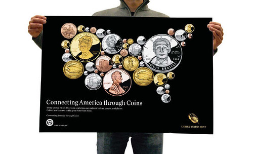
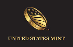
Additionally, the United States Mint aspired to increase sales of collectable coins, increase the uptake and use of dollar coins, and develop increased public awareness of the United States Mint as the only legal manufacturer of all American coins. After an extensive audit into the current state of the United State Mint brand, as well as competitor and best practice organizations, we began by establishing a fresh brand promise for the United States Mint: Connecting America through Coins. Unique in its impressive footprint on a captive audience � most Americans have its products in their pocket at any given time � the United States Mint is involved at numerous touch points with Americans, whether they're using coins to teach children to count or flipping a quarter at the 50-yard line of a football game. By presenting coins as part of the common language of America, as well as the lifeblood of commerce, the organization's new brand promise demonstrates the many stories and core values of America that unite us all. An accompanying visual identity system brought the brand strategy to life, and also gave the United States Mint the level of sophistication necessary to fully live up to its heritage. The coin symbol, flipping in the air, embodies an optimistic spirit that is symbolic of core American values and the everyday commerce of our country. The logo's craft and detail embody the artistic excellence the organization strives for in everything it produces, while the stars and stripes stand for the United States Mint's connection to the nation. Lastly, the stars represent the six United States Mint facilities, as well as America's six circulating coins.

My initial reaction to the high-priced logo makeover was "Well, that was stupid." After some consideration, I still think it's stupid. It doesn't even look much like a coin - it looks more like a flying wedding band. And the significance of the six stars will be lost on everyone but the logo designers who must be patting themselves on the back for being oh-so clever. "Craft and details"? I dunno about that.
The "Connecting America Through Coins" theme is kind of lame too, but probably more workable. We'll see - time will tell if any of this clicks with the buying public. I wrote this before I had a chance to look at this week's Coin World, and I see it was a front-page story. Beth Deisher's editorial was milder than my commentary, but she rightfully noted that "building a strong brand is more than rolling out a new logo. To be a top competitor, the U.S. Mint will have to "walk the walk" as well as "talk the talk." -Editor
To read the complete article, see:
Connecting America through Coins
(www.siegelgale.com/pdf/SG_CS_USMint_081310.pdf)
The Numismatic Bibliomania Society is a non-profit organization promoting numismatic literature. See our web site at coinbooks.org. To submit items for publication in The E-Sylum, write to the Editor at this address: whomren@gmail.com To subscribe go to: https://my.binhost.com/lists/listinfo/esylum All Rights Reserved. NBS Home Page Contact the NBS webmaster 
|
