PREV ARTICLE
NEXT ARTICLE
FULL ISSUE
PREV FULL ISSUE
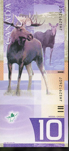
CANADA'S VERTICAL NOTE THAT ALMOST WASCanada's first vertical banknote, the Viola Desmond $10 bill entered circulation last year, but it wasn't the first time the Bank of Canada considered that format. Here's an excerpt from a blog post by Graham Iddon, of the Bank of Canada Museum. -Editor
Eventually, broad Canadian themes emerged that could be used to lay the foundation for a new note series: diversity, freedom, nature, history, activities, inventions and people. This last one ranged from individual achievers to generic traditional working types, such as the lumberjack or the fur trapper. Every aspect of a new bank note goes through sometimes dozens of versions before a final design is chosen. Even the themes are works in progress. The first theme tentatively settled upon for the new series was wildlife. After consulting with eminent naturalists, a number of animals were proposed—animals that were strongly associated with Canada, yet didn't have any nasty, human-eating reputations (grizzlies: big and scary, otters: cute and fun). In October 1998, the design and thematic criteria were handed off to the security printing firms. Their design teams went to work and came back with a surprising result: vertical notes. Designed by a team headed by Canadian Bank Note Company's Jorge Peral, the set proposed was a complete departure from anything before seen in Canada. Though freshly modern, the fronts were essentially traditional bank note patterns. The backs of the notes, meanwhile, were anything but. Vertical notes had occasionally popped up in Europe, but on this side of the Atlantic, these proposed notes were indeed radical. But these notes were not to be. In the end, a horizontal format was chosen, and the wildlife theme was abandoned for a very different approach to Canadian identity. However, the face designs of Peral's proposal were retained and further refined for the future series.
To read the complete article, see:

Wayne Homren, Editor The Numismatic Bibliomania Society is a non-profit organization promoting numismatic literature. See our web site at coinbooks.org. To submit items for publication in The E-Sylum, write to the Editor at this address: whomren@gmail.com To subscribe go to: https://my.binhost.com/lists/listinfo/esylum All Rights Reserved. NBS Home Page Contact the NBS webmaster 
|