PREV ARTICLE
NEXT ARTICLE
FULL ISSUE
PREV FULL ISSUE
FRENCH REVOLUTION BICENTENNIAL STAMPSWhile non-numismatic, this topic does have a numismatic connection - retired Bureau of Engraving portrait engraver Ken Kipperman, perhaps best known for his iconic Alexander Hamilton portrait on the $10 bill. For many years the BEP produced postage stamps for the U.S. Postal Service in addition to currency and other related printed products, and BEP engravers were also tasked to work on stamps. First, some background. Here is a July 16, 1989 Chicago Tribune article on the French Revolution Bicentennial stamps, a series produced jointly by the U.S. and France. -Editor 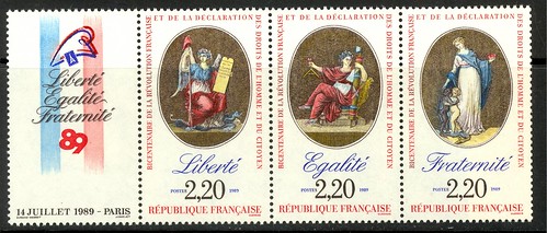
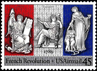
Stamps have been a means of expressing the goodwill that exists between the United States and France. The countries have issued stamps honoring each other, and both have participated in two joint issues. A third United States joint issue was issued July 14-Bastille Day-on the 200th anniversary of the French Revolution. The United States issued a 45-cent airmail commemorative in Washington. France issued three commemoratives of the event. The designs, as in virtually all joint issues between two or more countries, are almost identical.
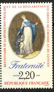
The U. S. Postal Service intentionally printed the stamp in red, silver and blue sequence to avoid any confusion with the blue, white and red, the colors of the French flag, used in the French issue. France issued its revolution bicentennial as three individual stamps and on three different days. The stamp representing Liberty was issued March 18 in Lyon, Equality on April 22 in Ermenonville and Fraternity on May 27 in Champagney. Each stamp carried a value of 2.20 francs. Previous joint issues were in 1983 on the bicentennial of the Treaty of Paris and in 1986 on the centennial of the dedication of the Statue of Liberty. The two countries have exchanged postal honors since as far back as 1927.
To read the complete article, see:
Ken explained in a phone call that the French Postal Service prepared their designs first, based on traditional allegorical representations of Liberty, Equality and Fraternity. The BEP would design closely related artwork for the USPS. In the end the engraving task was assigned to Ken. The French had created three separate stamps; the US would combine the representations on a single stamp. One of the BEP managers in charge insisted that the US stamp designs be rendered to look like white marble statues. More about that in a minute. As noted in the Tribune article, another major difference is that the colors, intended to represent the French flag, were reversed in the US stamp. Here's an excerpt from a June 5, 1989 New York Times article about the stamp. Collectors were noticing the differences. -Editor
Panel colors A Postal Service official and the designer of the stamp vigorously deny all three suggestions. The stamp, to be released July 14, Bastille Day, to mark the bicentennial of the French Revolution, shows three allegorical figures of Liberty, Equality and Fraternity, each against a colored panel. Together, the panels look like the French tricolor. Alas and alors! The colors on the 45-cent stamp, from the left, are red, white and blue; the colors on the flag, from the left, are blue, white and red.
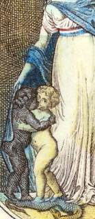
The Bare Breast "With nudity, sex and violence an integral part of our culture these days," said Dr. Bernard S. Moskow of Ridgewood, N.J., any such tampering with a stamp design "seems in the realm of the ridiculous." "That's silly," said Ms. Parks, attributing any omission to the great reduction in size of the figure. The designer, Mr. Sheaff, said it would have been an engraver's decision whether to use the tiny, tiny dot that would have been needed.
The Black Cherub But, Ms. Parks noted, all three figures have been redrawn in bas-relief to resemble statues, and in silver to stand out against the colored panels. Silver, she said again, not white, and without any thought of race.
To read the complete article, see:
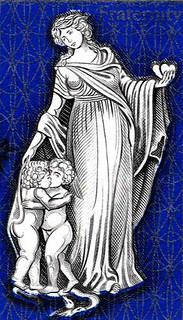
His boss told him everyone else was busy and he really needed him to do the work. Ken reluctantly agreed to do the engraving. He was faithful to the designer's artwork, right down to the nipple on the breast. But one day he came into work and found that someone else had altered the plate to remove it. Later Tom Hipschen told him he'd done the deed at the request of his supervisor. Tom Hipschen writes: "I had totally forgotten that. It was such a tiny thing to alter it would have taken no time at all. I was occasionally asked to work on other engraver's projects when something had to be done quickly and they were unavailable. It must have been some last-minute silliness from the Post office at a deadline. I doubt that my own superiors in the BEP would make any such changes arbitrarily." Ken adds: "Jack did an incredible amount of work redesigning the entire stamp. "I took great pride in very carefully engraving the very tiny nipple not as a dot but as a-perfectly round very tiny circle." Jack Ruther writes: "I MODELED that stamp, I did not DESIGN, or as Ken said, redesign it. To be honest, I do not remember changing a black baby to white in preparing the model. I would think that such changes as that would have come from the Postal Service to the designer of the stamp, before it came to the BEP. "DESIGNING means starting from scratch. We would have to research the subject and come up with one or more designs to submit to them. The Committee would then pick one for approval by the Postmaster General. If an outside artist was picked to create a design, their artwork would come through the Bureau for MODELING. Without altering the basic design, we would have to "fit" their artwork into the exact size ratios for the type of printing process it was scheduled for, and make any subtle changes that might be needed, again, for the engraving or the printing process. If we designed the stamp, we were noted as designer. In the other cases, we were the modeler. Many thanks to Ken, Tom and Jack for sharing the background with us! The New York Times article named a Mr. Sheaff as the Designer. A web search tells me his full name is likely Richard Sheaff. Jack Ruther was the Modeler, Ken Kipperman the Engraver, and Tom Hipschen was responsible for the breast touch-up. We may never know the full sequence of decisions and events, but the end product clearly had major differences from the French stamp designs. -Editor 
Wayne Homren, Editor The Numismatic Bibliomania Society is a non-profit organization promoting numismatic literature. See our web site at coinbooks.org. To submit items for publication in The E-Sylum, write to the Editor at this address: whomren@gmail.com To subscribe go to: https://my.binhost.com/lists/listinfo/esylum All Rights Reserved. NBS Home Page Contact the NBS webmaster 
|