PREV ARTICLE
NEXT ARTICLE
FULL ISSUE
PREV FULL ISSUE
V25 2022 INDEX E-SYLUM ARCHIVE VOCABULARY TERM: LETTERINGHere's another entry from Dick Johnson's Encyclopedia of Coin and Medal Terminology. I added the medal image. -Editor Lettering. The wording on coins and medals, often highly abbreviated. There are two kinds of lettering, those that follow the perimeter of the item – the legend – usually in an arc base line (called bowed), and all other lettering, the inscription. Lettering did not appear on the first coins of Lydia (in 640 bc), but appeared shortly thereafter, about 580 bc. It has been a necessary element of coin and medal design ever since. Coin and medal lettering is included in the study of epigraphy, and is of considerable importance because of the minimal amount of errors on numismatic and medallic items. Scholars and historians often refer to coins and medals for historical fact or corroboration of an event or date from the vast documentation that these contemporary items provide – the lettering appearing on coins and medals are presumed accurate with extremely high veracity. Language and letter forms. Lettering has appeared in many type styles in numismatic and medallic art, usually indigenous to the language on the piece. For example, fraktur type style appears on Germanic objects, the distinctive letter or word forms of Arabic and Oriental languages on the coins and medals of those areas. 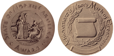
The customary letter form for numismatic wording is capital letters – upper case – a custom inherited directly from the inscriptions on Greek and Roman buildings. From time to time coin and medal designers have, however, experimented with lower case letters. American medallist Paul Manship once used caps and small caps on the obverse of the North Carolina Award Medal (63-34) and caps and lower case on the reverse. The type style on coins and medals is considered somewhat "heavy," what a printer would call bold face. Thin letters are not appropriate for numismatic design nor for striking. Letters on coins and medals appear with both serifs, the little tails or cross strokes on the ends of letter forms, and sans-serif, without these. Lettering by punches versus hand cutting. When most dies were prepared by hand – prior to 1900 – much of the lettering was done with punches, one letter at a time. Engravers maintained sets of letter punches – in sizes and styles suitable for their diesinking work. A punched letter saved the engraver time in hand cutting each letter; it also added uniformity and clarity to the inscription or legend. However, if he so chose he would hand cut the letters. Thus a wide variety of letter styles exists in numismatic and medallic art (but not anywhere near the many type styles found in printing). Generally letters formed by punches are flatter on top and have more steeply sloping sides with sharp angles at the bottom where the letter joins the background. There may be some doubling of letters as punches shift between blows. Hand carved letters on the other hand, lack uniformity and, depending upon the experience of the engraver, vary minutely in size and shape among the lettering. The best diagnostic evidence in determining that a die was made with punches (and probably hand engraved) is this uniformity of letter shapes. Modeled lettering. Some artists making oversize models to be pantographically reduced utilize FORM LETTERS. This is done to reduce the time of carving each letter. Other artists – in an attempt to retain more control over the appearance of the lettering and to make it as harmonious as possible with the design – will cast their own letters and attach each one to the model. Still others will carve the letters right in the model (more often the choice of the most experienced medallist). Modeled lettering appears more soft in appearance, generally with rounded tops, more sloping sides and the letters do not have the sharp angles that punches provide. With the increasing use of the oversized model, reduced by pantograph, lettering took on more flexibility and, more often, a pleasing appearance. Base lines. In all instances, the use of punches or form letters – or even hand engraving or carving letters by hand – an important function of the artist is to maintain an even base line. Tilted letters, or those off the base line, is the mark of an amateur or inexperienced engraver, seasoned diesinkers and medalists would never allow this on finished work. Not all base lines are straight. Placing letters on the bowed base line for the legend is quite critical and very common. The undulating base line, in wave form, is also difficult, but very uncommon. History of lettering. Lettering on ancient coins, including the first in 580 bc, was engraved by hand into the die along with the devices. Thus lettering was kept to a minimum. With the use of punches in the middle ages, all lettering was created with letter punches (and even some devices were formed with letter punches). It was not until the perfection of the die-engraving pantograph that an oversize model could be reduced all at once, with both devices and lettering that lettering was formed by the modeler. This occurred at the turn of the 20th century. Lettering problems. In addition to maintaining an even base line, forming the lettering on a design or a die – whether by punches or by modelling – the arrangement is of concern to the engraver or medallist. The size and arrangement of letters, the letterspacing, and the interspacial relationship among all elements of the design including lettering, are important. Lettering must be kept to a minimum because of space limits on every coin or medal. Thus the designer must be aware of these spatial limitations; words, titles and mottoes are always kept short or forced to be abbreviated. Cataloging lettering. The side of a coin or medal whose design is entirely lettering is called typographic and this should be noted in any cataloging. Several examples are illustrated here. This is the opposite of no lettering whatsoever, called anepigraphic. Lettering with Roman numerals in large size than the rest of the lettering – spelling out the date – is a chronogram, and of vital importance in dating the piece; it should always be noted in cataloging. Lettering that is added after the medal was issued, as a name and date of an award, is called inscribed. Lettering removed from a medallic item is called obliterated. An example might be a recipient who removes his name (literally grinding it off) before he disposes of the piece, such an area is called obliterated name. It too, should be noted in cataloging. If a new name is added, it is called renamed. The type style is not usually recorded in cataloging numismatic items. The exact wording, however, is recorded precisely, including punctuation, along with dots, center dots and ornaments. Arms or stems of letters may be described as pointed or blunt.
To read the complete entry on the Newman Numismatic Portal, see:
THE BOOK BAZARREWayne Homren, Editor The Numismatic Bibliomania Society is a non-profit organization promoting numismatic literature. See our web site at coinbooks.org. To submit items for publication in The E-Sylum, write to the Editor at this address: whomren@gmail.com To subscribe go to: https://my.binhost.com/lists/listinfo/esylum All Rights Reserved. NBS Home Page Contact the NBS webmaster 
|