PREV ARTICLE
NEXT ARTICLE
FULL ISSUE
PREV FULL ISSUE
READERS CRITIQUE DANIEL CARR'S HARD TIMES TOKEN (OR IS IT A MEDEL)? Many thanks to the E-Sylum reader who tipped us off to the new "Hard Times Token" created by Daniel Carr. Our readers chimed in with the following reactions to the design. -Editor Harold Levi writes: I love this token! The obverse design should must be adopted by the Social Security Administration for their logo! Our Sons of Confederate Veterans Camp has been operating a Confederate Veteran Retirement Fund based on Social Security for some time now. Donations are moved to the general fund, but will be reimbursed to the retirement fund if a bona fide Confederate Veteran applies for retirement. Since the last Confederate soldier died December 19, 1959 we are unlikely to have a funding problem. 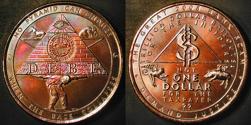 Dick Johnson writes: There is so much good in this medal -- and its satirical design! -- illustrated in last week's E-Sylum that to criticize even one tiny portion of it seems sacrilegious. But here goes. I apologize in advance for using the word "excellent" so often. You first notice the color, the patina, excellent. Your eye is drawn to the obverse pyramid, the featured device; this is rendered in excellent detail. The All-seeing Eye and the U.S. Treasury seal is right off the dollar bill for the symbolism of money, emphasized by the word DEBT below. Excellent. The human figure bent over with arms outstretched supporting the pyramid brings the satirical nature into sharp focus. It is modeled with enough detail to indicate the man's weariness. Excellent. The subsidiary devices of the political parties' symbols, the donkey and elephant, are supported by the arms forming a six-pointed star. Excellent use of subsidiary devices, a numismatic star and spacing. The human figure becomes the lower point of the star. That is subtle and excellent. The incuse obverse legend on a very lightly textured background within a linear border is -- you guessed it -- excellent. A similar style legend treatment and repeated pyramid design appears on the reverse. Double excellent. This incorporates the art characteristics of Parallelism and Agreement. So you see why I say "double excellent." The reverse is a tad bit busy. It could be improved by switching and removing some lettering. Delete "demand justice." Switch the double-line legend at the top to the outer border in one line just inside the medal edge. Double-line legends are killers to maintain continued eye interest. I love the broken dollar sign, that earns a Big E. I also love the legend NOT ONE DOLLAR FOR THE TAXPAYER. Here I would recommend dropping the two question marks and making the word TAXPAYER into an arc legend just inside the inner border. The flying monkey and flying pig add charm that are art Repetition to the two political symbols on the obverse. Two more "excellents." Overall this is an an exceptional design by a highly creative and talented artist working in modern technology -- on his own computer medal design software -- resulting in a timely and desirable medallic item. Congrats Dan. Now you might be saying, "Who the hell are you to criticize Dan Carr's medal?" Well, I was trained by the best medal critic in America, Julius Lauth, vice president & art director of Medallic Art and 40-year medallic veteran when I worked for the company in the 1960s and 70s. He oversaw the company's productions and dealt with perhaps 350 medallic sculptors in creating hundreds of medals a year. He was also chairman of ANS Medals Committee at the time. Julius taught me what is good and what is bad in medallic art. I also saw him in action in dealing with artists (whose egos could be so easily bruised). I was standing at the sculpture table once when a sculptor laid out a pair of models he just completed. Julius viewed the reverse which had a tree on it. Pointing to an open area he asked the artist in a low voice "Would it improve the design to have more tree limbs here?" The artist fell all over himself agreeing with Julius and agreed to remodel the reverse -- another day's work -- with Julius' subtle suggestion. "By George, Julius, I believe it would," he said. I wish I could treat medallic artists like Julius did. Dan, all I am suggesting is to remove a couple of tree branches on your reverse. Make another reverse die -- you can sell twice as many to collectors -- type I and type II. You have created an absolutely stunning medallic design here. It's Excellent! To read the earlier E-Sylum article, see: NEW "HARD TIMES" TOKENS FROM COIN DESIGNER DANIEL CARR (http://www.coinbooks.org/esylum_v12n02a17.html) Wayne Homren, Editor The Numismatic Bibliomania Society is a non-profit organization promoting numismatic literature. See our web site at coinbooks.org. To submit items for publication in The E-Sylum, write to the Editor at this address: whomren@gmail.com To subscribe go to: https://my.binhost.com/lists/listinfo/esylum All Rights Reserved. NBS Home Page Contact the NBS webmaster 
|