PREV ARTICLE
NEXT ARTICLE
FULL ISSUE
PREV FULL ISSUE
ON PERSPECTIVE IN MEDAL DESIGNSteve D'Ippolito submitted these thoughts on perspective in medal design, inspired by Dick Johnson's article last week.
-Editor
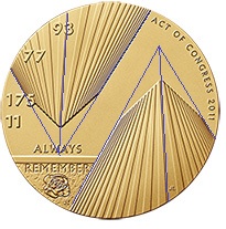
Here are a couple of photographs to show how it works in reality. The first is taken from between a pair of skyscrapers, though they aren't the WTC: 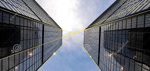 (Note that the lines don't even have to be drawn off the corners of the building--ANY vertical line, even those between columns of windows, will converge to the same point because it's parallel to every other vertical line.) And here's the actual WTC, though not taken from a point between the towers. 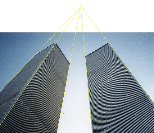 In this case the point of convergence or vanishing point is outside the photo (the fact that the yellow lines don't quite meet is symptomatic only of my imperfect vision and clumsiness with the mouse). Whatever one may think of the merits of the medal design, one thing it surely isn't is an example of vaulted perspective, because it's not even remotely properly done. I'm sure the artist did this deliberately, because it's simply too glaring to be a mistake. While I heartily endorse the desire to memorialize what was destroyed on that awful day (I did buy one of the medals myself) I found the incorrect perspective very distracting. It suggests to me the towers caught in the act of toppling almost toward each other (even though they didn't). Which, come to think of it, could be exactly the impression the artist was trying to make. You know, I thought something was a little off about that design, but I couldn't put my finger on it. I think Steve nailed it.
-Editor
On a related note, Dave Lange writes: In reading Dick Johnson's comments about the Fallen Heroes Medal, he commented that it depicts the new towers rising. It appears to me, however, that it actually depicts the old Towers 1 and 2 that were lost on 9-11. To read the earlier E-Sylum article, see:
 Wayne Homren, Editor The Numismatic Bibliomania Society is a non-profit organization promoting numismatic literature. See our web site at coinbooks.org. To submit items for publication in The E-Sylum, write to the Editor at this address: whomren@gmail.com To subscribe go to: https://my.binhost.com/lists/listinfo/esylum All Rights Reserved. NBS Home Page Contact the NBS webmaster 
|