PREV ARTICLE
NEXT ARTICLE
FULL ISSUE
PREV FULL ISSUE
DESIGN OF THE 2018 WINTER OLYMPIC MEDALSThe Hyperallergic blog interviewed Sukwoo Lee, the designer of the 2018 Winter Olympic medals. This is the most detail I've come across yet, and it's straight from
the artist. -Editor
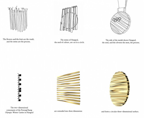
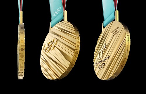 Every two years, the International Olympic Committee either holds a competition or chooses an individual or team from the host country to come up with a unique design for that specific Olympics. The design of the Summer Olympics medals is fairly strict — they must always include an image of Nike, the goddess of Victory — but the Winter Olympic medals start from a blank slate, although the designer is usually expected to incorporate the spirit of both the Olympics and the host culture into the medals themselves. This has resulted in a wide variety of designs, forms, and materials. For this year’s events at Pyeongchang, the Olympics authorities approached Sukwoo Lee, an industrial designer based in Seoul. Lee’s company, SWNA, designs everything from robots to umbrellas and lamps. In an email to Hyperallergic, Lee said he presented five different concepts in the lead-up to the Olympics, all of them inspired by the landscape and culture of Korea. He said the four rejected proposals were “designed using the mountains of Pyeongchang as a motif, or using wind, trees, and Korean traditional ornaments as materials. The inside of the present [design] is the most modern, but it seems that the DNA of Korea is well expressed.” The medals hanging around winning athlete’s necks this year take their inspiration from the Korean alphabet, as well as from traditional clothing and architecture. In a poetic illustration Lee provided Hyperallergic, the designer presents the alphabet, Hangul, as “the seed of our culture. We sow the seeds of culture. The seeds grow into a culture.” Once the seeds are fully grown and the flowers and fruit picked through, what’s left are the stems — “the stems are the process.” These individual “stems” of culture are then bunched together and cut into the circular shape of the medal, creating a bumpy surface but cut so you can still read the individual letters on the side. As for the traditional Korean clothing and architectural motifs, those come into play in the ribbons, made out of the same fabric as hanbok, and the upturned eaves of the wooden medal cases. “I like experimental medals,” Lee said, adding that his favorite design from past Olympics is Dario Quatrini’s Torino 2006 medals with the hole in the middle. (He also liked the polycarbonate of the 2014 Sochi medals.) See the article online for the full set of sketches and illustrations of the ribbons and case. -Editor
 To read the complete article, see: To read the earlier E-Sylum articles, see:  Wayne Homren, Editor The Numismatic Bibliomania Society is a non-profit organization promoting numismatic literature. See our web site at coinbooks.org. To submit items for publication in The E-Sylum, write to the Editor at this address: whomren@gmail.com To subscribe go to: https://my.binhost.com/lists/listinfo/esylum All Rights Reserved. NBS Home Page Contact the NBS webmaster 
|